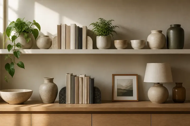
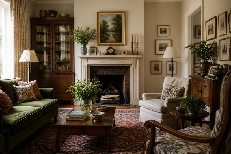
The Neutral Palette Is Not Automatically Calm
A neutral palette can feel restful or restless. Learn how contrast, undertones and colour distribution shape a room, and make a more deliberate choice.
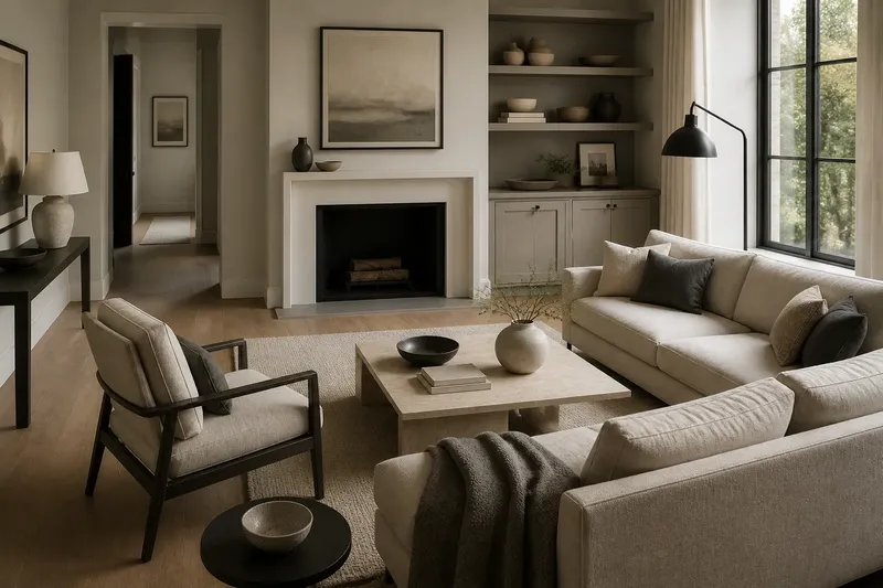
A neutral palette can make a room feel restless as easily as restful. The effect depends on how strongly its colours differ, whether their undertones agree, and where each colour sits in the room—not simply on whether the paint is beige, grey or white.
Neutrals are colours with subdued or ambiguous hues, including cream, stone, taupe, grey and many off-whites. They can recede from attention, but they do not disappear. A near-white wall beside a deep charcoal sofa creates a sharper visual event than two similarly light colours, even though both choices belong to a neutral scheme.
Why can a neutral room still feel busy?
Because low-saturation colours can still create strong contrast. Contrast is the perceived difference between neighbouring colours, especially in lightness. A room with pale walls, dark flooring, black frames and bright white trim may contain no vivid colour, yet the eye keeps moving between distinct boundaries.
Repeated contrast can make a room feel crisp and deliberate, but it can also seem unsettled if the differences are scattered. Think of a page printed in black and white: it may use only two colours, but a dense pattern of alternating marks can feel more active than a large, quiet field of grey.
Look at the room from its entrance and notice where your eye lands first. If it jumps from a dark lamp to a white mantel, then to a black picture frame and back to the floor, the distribution of contrast may be doing more to shape the mood than the palette name.
How does contrast change the feeling of a neutral palette?
Strong light-dark contrast tends to make edges and objects more prominent; closer values tend to soften their separation. Neither is automatically better. A quiet bedroom might benefit from pale oak against warm white, while a room used for focused work may suit clearer distinctions between a desk, wall and shelving.
Contrast also comes from adjacent surfaces, not just large furniture. A bright white skirting board can outline a grey wall; a dark grout line can make pale tiles read as a grid. Before changing a wall colour, consider these smaller boundaries, which may be creating much of the visual sharpness.
Say you have a cool grey wall, a cream sofa and a black metal floor lamp, and the corner feels jumpy. If you shift the lamp away from the sofa and use a softer, darker grey cushion near the wall, the expected result is a less abrupt sequence of light and dark—not a room without contrast, but one where its strongest edge is less crowded.
What do undertones do in neutral colours?
Undertones are the subtle colour casts within a shade. A grey can lean blue, green, violet or brown; a white can appear creamy or cool. Place two neutrals together and those underlying casts become easier to see, especially under the room’s existing light.
When undertones pull in different directions, a scheme may feel discordant even if its colours are similarly pale. A yellowish cream next to a blue-grey can make the cream appear more yellow and the grey more icy. That contrast may be purposeful, but it is not the same as a softly blended palette.
Compare candidate colours beside the actual flooring, upholstery or tile rather than judging them alone. A paper paint chip is useful for narrowing options, but a larger sample on the intended wall gives a clearer sense of how a shade relates to nearby materials. Check it in daylight and under the lamps normally used in the room; artificial light can shift how warm or cool a neutral appears.
Where a neutral colour sits matters as much as its name
Distribution describes how colour is spread across a space. A dark neutral confined to a small object may read as an accent; the same shade across a large sofa or floor becomes a substantial visual weight. Similarly, bright white on a ceiling may seem unobtrusive, while white cabinet fronts can dominate because they occupy more of the direct view.
Consider the room’s sightlines: the surfaces visible together from the doorway, from the main seat or along a corridor. If the darkest colours cluster on one side, that area may feel visually heavier. If light and dark details alternate throughout the view, the eye may keep scanning instead of settling.
This is why a swatch alone cannot tell you whether a neutral scheme will feel calm. A colour’s effect depends on its area, neighbours and position. Treat a palette like a set of objects on a shelf: the same pieces can feel balanced or scattered depending on how they are arranged.
How can you tell whether your neutral palette feels restful?
Use the room itself as the reference, and ask specific questions about what catches your attention. You do not need to make every surface match; the aim is to understand which contrasts and colour relationships are producing the feeling you want to change.
- Which edge catches your eye first? Identify the wall, trim, furniture or frame that creates the strongest light-dark break.
- Do nearby neutrals share an undertone? Compare paint, fabric and flooring side by side in the room’s ordinary light.
- Where are the darkest colours concentrated? Notice whether they form one visual anchor or several competing points.
- Are bright whites outlining many surfaces? Check trim, tile grout, shelves and lampshades for repeated sharp boundaries.
- Does a large surface dominate the view? Consider the floor, curtains or sofa as areas of colour, not just as separate objects.
Change one relationship at a time. For instance, if a pale wall looks cold beside a warm timber floor, compare a softer off-white sample before replacing other furnishings. A small, deliberate adjustment can reveal whether the issue is the wall’s undertone, the contrast at the floor edge or the combined effect.
Can warm and cool neutrals work together?
Yes, if their differences look intentional within the room. Warm neutrals such as sand, cream and many browns can make a space feel more enveloping, while cool greys and blue-leaning whites can appear cleaner or more distant. Mixing them can create useful depth, but a small clash may stand out when the surrounding palette is restrained.
Repeat a subtle undertone or material to connect the groups. A grey wall and a cream armchair might feel more considered beside natural oak, whose visible grain can relate to the warmer fabric without making the colours identical. The aim is a readable relationship, not uniformity.
Does white make a room feel calmer?
Not on its own. White can make surfaces feel open, but a very bright white beside dark fittings, high-contrast artwork and black-edged flooring may produce a crisp, active impression. A softer white can reduce that sharpness, though the result still depends on the room’s other colours and their distribution.
How should I choose between beige and grey?
Start with the fixed elements you are keeping, such as the floor, stone worktop or large sofa. Compare beige and grey samples beside those materials and notice which undertone sits comfortably with them; then consider the room’s light and the mood you want, rather than treating either colour as a universal calming choice.
Can a small accent colour make a neutral room calmer?
It can help the eye settle if it links elements that otherwise feel disconnected, such as a muted green repeated in a cushion and a small ceramic object. An accent can also add another point of contrast, so use it with attention to where it appears and what it sits beside.
Should all the neutrals in a room match?
No. A room can use different neutrals for depth and distinction, provided their undertones and contrasts work together. Matching every shade may flatten the space, while unrelated shades can make it feel fragmented; judge the whole view rather than seeking identical paint, fabric and wood tones.
The useful question is not whether a neutral palette is calm by definition, but which relationship is making this particular room feel calm or unsettled. When you assess contrast, undertone and distribution together, the neutral palette becomes easier to adjust with purpose—and the colour name becomes only one part of the decision.