A Window-Sill Arrangement for a Grey Afternoon
A window-sill arrangement can turn a few familiar objects into a seasonal display; use height, silhouette and deliberate gaps to keep it calm and easy to change.
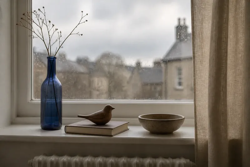
A window-sill arrangement can feel cluttered even when it contains only a few things: a tall bottle may block the light, or several similar shapes may merge into one uncertain outline. On a grey afternoon, use the sill as a temporary display and adjust height, silhouette and gaps before adding anything new.
The aim is not to fill the whole ledge or create a miniature scene. It is to let a handful of objects read clearly against the window, then move or remove them when the season or your mood changes. Start with what is already in the room: perhaps a small ceramic bowl, a paperback, a smooth stone, a candle holder or a glass jar.
Begin by checking what the sill can hold
Before arranging anything, look at the sill as a working surface as well as a visual one. Notice whether it is deep enough for the objects, whether the window opens inward, and whether curtains, blinds or a radiator compete for space. A display that catches fabric or obstructs a handle will soon become a nuisance.
Clear the surface and wipe away dust, then set aside objects that are damp, fragile or likely to mark the paint. Do not put a lit candle, a plant needing frequent watering or a glass vessel in direct sun without considering the heat and moisture involved. For anything whose care depends on a label, manufacturer instructions or local rules, follow those directions.
Choose a small group with different visual roles rather than a collection of prized possessions. One object can provide height, another a broad or rounded shape, and a third a low accent. If each item is equally tall and similarly shaped, the arrangement may look like a row of unrelated objects rather than a composed display.
Set a clear height rhythm
Height gives the eye a route through the arrangement. A useful starting point is one noticeably taller object, one medium-height object and one low object, though the exact proportions depend on the sill and the view. The taller piece might be a narrow vase or bottle; a shallow dish can supply the low point.
Put the tallest item slightly to one side rather than directly in the centre. This leaves room for the rest of the group to step down in height, and it avoids making the display resemble a symmetrical row. Keep the objects low enough that the window remains useful: if the arrangement interrupts the view or makes the room feel darker, reduce the tallest item or move it away from the main sightline.
Imagine you have a low sill, a narrow blue bottle, a paperback and a small wooden bird. Place the bottle near one end, stand the book on its closed cover or lay it flat depending on its shape, and set the bird near the book. The expected visible result is a descending profile rather than three objects competing at the same level. If the book’s upright edge looks too rigid beside the bird, lay it flat and reassess the outline.
Compare silhouettes before judging colour
A silhouette is the outer shape an object makes against its background. At a window, backlighting can flatten colour and make pale or transparent items difficult to distinguish, so look at the edges first. A narrow-necked bottle, a rounded bowl and a block-like book are easier to read together than several vessels with nearly identical outlines.
Stand back and briefly narrow your eyes, or look at the group from the room’s entrance. This softens small details and makes the large shapes easier to compare. If two objects fuse into one outline, shift one sideways, turn it, or choose a different item whose profile contrasts more clearly.
Turn objects to show their more legible side. A mug’s handle can create a useful break in its outline, while a small sculpture may look clearer in profile than head-on. This is a matter of what the eye can distinguish from across the room, not whether an object is attractive in isolation.
Use gaps as part of the arrangement
Empty space is not a missing decoration. It separates silhouettes and lets each item keep its own outline, much as a comma gives a sentence room to pause. Begin with a visible gap between every object, then bring two pieces closer only if they look like they belong together.
Check the spaces between objects as well as the space at the ends of the sill. A large gap in the middle can divide the display into two unrelated groups; a gap that is too narrow can make shapes touch and become hard to read. Move items in small amounts and compare the overall balance from the place where you usually see the window.
Do not aim for identical spacing. A compact pair beside a more isolated object can feel natural if their heights and silhouettes support that grouping. The useful test is whether the empty areas look intentional: if one gap seems accidental, adjust the objects rather than filling it with another small thing.
What usually makes a sill display feel wrong?
Why does the arrangement look like a row?
Objects placed at equal intervals and similar heights often read as a line, even when their colours differ. Vary the height and bring one pair slightly closer, leaving a clearer gap before the remaining object.
Why do the objects disappear against the window?
Backlight can erase the edges of clear glass or pale materials, while dark shapes may become stark outlines. Move a transparent item away from the brightest section, turn a solid object to show a distinct profile, or use the sill or curtain as a less confusing background.
What should I change if the display blocks the view?
The tallest object may be occupying the most useful part of the window, or the whole group may sit directly in the central sightline. Shift the tallest piece towards an edge, lower it, or remove it; the display should not force you to look around it.
How can I make the arrangement feel less busy?
Too many small items create many competing edges, and similar objects can look like a collection rather than a simple composition. Remove one piece first, then reconsider the gaps and silhouettes before adding anything back.
Adjust for the season without building a themed scene
A seasonal display can come from a modest change rather than a pile of themed decorations. In a grey spell, a warm-toned bowl, a branch in a sturdy vessel or a folded piece of fabric can introduce a different texture or outline. Keep the same basic height rhythm and exchange only one or two elements when the light, weather or room use shifts.
Think about how the view changes through the day. A glass jar may catch soft light but become difficult to see when the sky is bright; a dark wooden object may read clearly against the window on an overcast afternoon. The point is not to predict every lighting condition, but to notice whether the display remains distinct from the room.
Use fresh branches or other natural materials only if they can sit safely and neatly. A vessel that tips easily, sheds onto the sill or leaves moisture behind is a poor fit for a temporary display. A dry leaf or smooth stone can suggest the season without needing water or ongoing care.
Keep the display easy to live with
A window sill has practical jobs: it may need to stay clear for opening a window, cleaning, or letting light through. Leave an accessible strip where needed, and avoid placing objects where they could fall if the sash moves or the sill is bumped. If the space is narrow, a single low object may suit it better than a group.
Choose materials that make sense for the surface. Felt beneath a ceramic piece can help avoid scratches, while a stable, flat base is preferable to a rounded object that rocks. Keep paper away from condensation and protect painted wood from items that could leave damp marks.
When the arrangement starts to feel stale, do not assume it needs a new purchase. Remove one object, turn another, or swap their positions and look again from the room. A window-sill arrangement works best as a light, changeable composition: its most useful feature may be how quickly you can clear it when the view, weather or daily routine asks for the space back.